Today we ( I ) set up the group blog for our blog. Firstly, we thought of calling our group blog "The Chris, Ed, Jon and Jack Blog" but upon seeing another group using the name "The Fellowship" We made a group decision to one up them and go with "The Rebel Alliance" which is a much more superior group name.
The other members of The Rebel Alliance tried to assist with my task, realistically, it can only be done on one computer, so I did all the work.
Friday, 21 October 2011

Sunday, 16 October 2011
Thriller Sub-genres
As thriller is such a broad genre, for classification, it is divided into many more specific sub genres, such as:
Conspiracy Thriller
In which the protagonist faces a powerful group of enemies and is typically the only character, or one of very few characters aware of the threat and therefore participating in the conflict.
Crime Thriller
A hybrid of crime and thriller genres that are typically a suspenseful recount of a crime. They typically focus more on the criminal as opposed to the law enforcement and concentrate on action instead of psychological aspects.
Legal Thriller
In which the protagonist, typically a lawyer or attorney has a conflict with antagonists both inside the courtroom and outside. Also, there is frequently a danger to the protagonists lives that separates it from similar genres such as courtroom dramas.
Political Thriller
A thriller in which the conflict falls around a political power struggle. Typically involve giving illegal political power to an antagonist or criminal. Almost always involve national or international politics.
Psychological Thriller
A thriller in which the key conflict is psychological or emotional rather than physical. The protagonist normally stumbles into the conflict by accident and does not start out as one of the main sides to the conflict. Characters normally use more mental means to overcome their enemies, if the enemies are not themselves, as is common in some psychological thrillers.
Supernatural Thriller
In which the conflict typically involves supernatural or paranormal aspects, sometimes as part of the characters' abilities or as part of the setting around them.
 |
| Edge of Darkness |
In which the protagonist faces a powerful group of enemies and is typically the only character, or one of very few characters aware of the threat and therefore participating in the conflict.
 |
| Seven |
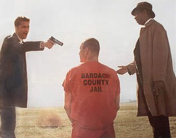
Crime Thriller
A hybrid of crime and thriller genres that are typically a suspenseful recount of a crime. They typically focus more on the criminal as opposed to the law enforcement and concentrate on action instead of psychological aspects.
Legal Thriller
 |
| Law Abiding Citizen |
 |
| The Ghost |
A thriller in which the conflict falls around a political power struggle. Typically involve giving illegal political power to an antagonist or criminal. Almost always involve national or international politics.
 |
| Fight Club |
A thriller in which the key conflict is psychological or emotional rather than physical. The protagonist normally stumbles into the conflict by accident and does not start out as one of the main sides to the conflict. Characters normally use more mental means to overcome their enemies, if the enemies are not themselves, as is common in some psychological thrillers.
 |
| Unbreakable |
In which the conflict typically involves supernatural or paranormal aspects, sometimes as part of the characters' abilities or as part of the setting around them.
Thursday, 13 October 2011
Editing Techniques
Match on Action
A match on action is an editing technique which shows an action being completed over multiple shots, typically with the action in the first shot, and the result of the action in the second shot.
An example occurs in this clip of Kill Bill at 1.25 through three shots.
Shot - Reverse Shot
A shot reverse shot is a technique which typically shows a conversation, cutting back and forth between two shots, one of each character, that stays within the 180 degree rule. As the characters are facing in opposite directions in the shots from their perspective, it is assumed by the audience that they are having a conversation
An example of this in Inglourious Basterds starts with the conversation at 0.29.
180 Degree Rule
The 180 degree rule is a rule used for continuity editing that places an imaginary line passing through two characters. The camera is only allowed to stay on that side of the line and crossing the line would be disorientating to the audience. It means that both of the characters stay on one side of the shot, while crossing the line would mean they switch sides.
An example of following the 180 degree rule is in this scene from Death Proof.
Friday, 7 October 2011
Psycho Commentary Reflection
To make our film clip commentary, we first found and watched a clip from our chosen film, Psycho. As we watched it, we made notes on what we saw, particularly on the thriller conventions that we saw, such as the shadow motif. After we had rewatched the clip enough times and made sufficient notes, we added to the notes, making them into full paragraphs. We then downloaded the clip from Youtube, and adding it to iMovie so we could add a commentary. After this, we split the notes into three, and we each read our third by reading and recording a paragraph at a time, and then positioning them to fit better to the content and timings of the clip. However, we did have some difficulty with this as most of what we had to say all occurred very quickly, so we had to reposition some audio to allow the whole commentary to fit. We then uploaded the clip to Blogspot.
Through this exercise, i have acquired a better understanding of how film commentaries and voiceovers work, and how even very short clips can have very large amounts of cinematographical details to analyse. I also learnt how difficult it can be to get a commentary to match up to what is happening on screen. I also noticed how subtle some elements of the cinematography can be in a clip, and how they can only be noticed through repeated viewings or paying attention to very specific details, such as how Lila hits the light as she screams and creates the dynamic lighting found in the rest of the scene, and how subtle some of the motifs can be, so a casual watcher might not consciously be aware of them.
Through this exercise, i have acquired a better understanding of how film commentaries and voiceovers work, and how even very short clips can have very large amounts of cinematographical details to analyse. I also learnt how difficult it can be to get a commentary to match up to what is happening on screen. I also noticed how subtle some elements of the cinematography can be in a clip, and how they can only be noticed through repeated viewings or paying attention to very specific details, such as how Lila hits the light as she screams and creates the dynamic lighting found in the rest of the scene, and how subtle some of the motifs can be, so a casual watcher might not consciously be aware of them.
Sunday, 25 September 2011
Thriller Conventions
The thriller genre is characterised by it's use of tension and suspense, shown through the narrative but also through sound and editing. Of course, a vast majority of films use tension and suspense making thriller one of the more broad genres of film.
The key conventions found in most of thriller films are:
Narrative


 Editing
The key conventions found in most of thriller films are:
Narrative

- Often feature a crime at the heart of the narrative.
- An enigma, for example, in a mystery thriller, the enigma would be the mystery that forms the narrative.
- A complex storyline, using red herrings and cliffhangers.
- Narratives often involving conspiracies, pursuit or investigations.
- The protagonist uses intelligence to solve the mystery or win against the antagonist, as opposed to brute force.
Characters

- A protagonist with a mysterious past that is only alluded to during the film/
- Often a more "anti-hero" style protagonist.
- Antagonist and protagonist on opposite sides of the law.
- Protagonist normally in an authority figure position, as well as one that's slightly more dangerous, such as police officers in Silence of the Lambs and Se7en, or experienced criminals such as in Reservoir Dogs.
- The protagonist will often have a flaw that is exploited by the antagonist, such as John Ferguson's vertigo in Vertigo or Clarice Starling's inexperience.
- A more street-smart and savvy protagonist.
Mise en Scene
- Modern, urban settings.
- Dark environments and low key lighting.
- Use of modern props: mobile phones, computers and cars.
- Weapons such as guns often feature.
Sound
- Suspenseful music, often at key scenes.
- Mostly music suited to the setting and time, such as more modern synthesized music for thrillers such as the Bourne trilogy.
 Editing
- Fast paced editing.
- Quick cuts.
- Obtrusive editing.
- Wide variety of shot types
Sunday, 18 September 2011
Movie Intro Sequence Analysis
http://www.artofthetitle.com/2008/03/17/300/
The title sequence to 300 uses graphics reminiscent of a graphic novel, of which the film 300 is based. This automatically clues the audience as to the style of the film as a whole, and that is more closely follows the graphic novel, as opposed to the original historic event. The images also use a limited colour palette, mainly black for the figures in the foreground, and orange and cream for the background, with uses of red for blood and white for the moon, these colours are also the main colours used during the film itself. The background uses a parchment texture as well, which brings the film's setting to mind along with the graphic novel basis and the colours used almost make the background seem like a watercolour painting, giving it a more artistic feel. The colours are mainly quite dark and this highlights the way in which the film is presented, as it is quite dark and gritty with the content. At the end of the sequence, the background becomes a lot more simplistic towards the end, with just a plain black background, and the blood spatters remaining.
The intro sequence uses a lot of fast camera movements, such as tracks and zooms, to move around the graphics. This creates a more interesting and dynamic feel to the title sequence. Also, when the camera is closest to the figures and they do the most of their movements instead of staying mostly static, it becomes slow motion, which is a stylistic choice used all throughout the film, introducing the audience to it.
Uses of non diegetic sound include a war like drum beat through out, reflecting the battle taking up most of the film's length. It also uses a primal screaming to suggest the brutality of the war, emphasizing the dark nature of the film. There is also a sort of Greek/Middle Eastern string instrument, which alludes to the setting of the film. Also, the sequence lacks a lot of diegetic sound. Normally, the blood splashes and spears hitting people would use a lot more diegetic sound than this sequence does, which seems to prefer to use a quick burst of war like horns whenever a spear hits and no noise at all for the blood, creating a less realistic and more "fantasy" mood for the film. There are some uses of diegetic sound, such as the spears hitting the final person before "300" appears on screen, and the sound of a spear cutting the air as the camera quickly pans past one, but it is still a small amount of use of diegetic sound.
The typography of the titles is very stylistic, using the same colour and appearance as the blood spatter but with a more stylised, graphic novel typography. Also, once they appear, they remain static, placed on the background instead of following the camera. This creates the illusion of the camera moving through a graphic novel, which is supported by the fact that the words are flat and two dimensional, as are the backgrounds.
http://www.artofthetitle.com/2011/09/05/taxi-driver/
The title sequence to Taxi Driver begins with a black background, and the first titles appearing in a simple orange font. This is a very slow opening, in complete contrast to 300's opening, where it almost immediately focuses on the action., and perhaps reflects the general slow approach that the film takes, which the fading in and out of the titles might also suggest. It also puts absolute focus on the titles, making it clear that Robert deNiro is the protagonist and that the film is mainly about his character. There is also a very long delay between the word "in" and the actual name of the film, allowing for the flashier (for the time) main title to appear.
Just before the first shot, a non diegetic drum roll builds up and introduces it, a shot of completely opaque smoke obscuring the screen, introducing the urban environment and the film's more depressing, realistic vision of 1970's New York. Eventually, a slow moving taxi drives through the thick smoke and as it leaves the frame, the title appears behind it, in a more three dimensional version and neon yellow version of the earlier titles' font, in front of more swirling thick smoke. Later titles appear in the same colour, evocative of a New York taxi's famous colour scheme and the font seems to be the same style found on taxi's as well, showing a major part of the film's focus in a more subtle way than the taxi appearing through the smoke.
The non diegetic sound contines as a slow paced jazz song, calming down after the dramatic opening slow drum roll and crescendo of instruments as the taxi appeared. The soundtrack also seems quite melancholic and thoughtful, but not overwhelming so. The use of the jazz genre seems key here, as it uses jazz' associations as being more urban and modern than using classical music would. This sequence, like 300, uses very little diegetic sounds, which seems strange for the realistic style the film seems to be using, but it makes the audience seem quite disconnected from the world, as they hear nothing of it, and for the most part, cannot seem much of it.
The next shot is an extreme close up of Robert deNiro's character's eyes as he looks around, but the audience again feels disconnected as they cannot even see what he is looking at. It also places a focus on that particular character and the sad, tired expression that his eyes seem to show, allowing the audience to see exactly how he feels and his general emotions and attitude from a single shot. Also the cuts between each shot are very slow fades, which go with the emotions of Robert deNiro's character and the slow fades of the titles and the slow music and give the opening sequence a slow and tiring effect, placing the audience in this character's place.
The non diegetic sound also changes to a different jazz song, as slow paced as the last, but seeming slightly more romantic, which coupled with the blurry shots of New York and it's bright neon lights from the inside of the taxi, seem to suggest a sad romance with the city. Also, these slowed down blurry POV shots further emphasise the disconnection to the outside world, and reveal that it's Robert deNiro's character who feels this disconnection.
The opening title sequence for Limitless seems quite simplistic, but is very effective and suits the film. On watching, it seems like one entirely long shot, which constantly seems to be zooming in. This gives a very mind bending and surreal effect and becomes very mesmerising as the camera constantly moves along one street in New York. This effect also introduces the key part of the film, where the main character becomes more intelligent and as a result, a lot more aware of everything in his surroundings. This allows the audience to experience how he feels when he appears just before the title sequence. The very start of the shot, the camera is sideways, while the main title and the street itself appear vertical on the shot. The camera then rotates as it zooms forward to become level with the street. Towards the middle of the sequence, it zooms into an electronic billboard and starts zooming through an orange visualisation of a brain until one part of it turns into a satellite image of Manhattan before zooming into a building and whiting out.
The typography of the titles is much more simple in Limitless, with a simple sans serif font and a pale yellow colour. They also have a simple placement on the frame, just appearing at the bottom of the screen, instead of 300's more inventive placement and Taxi Driver's titles which appear around the screen. This makes the titles a lot more conventional, balancing out the outlandish zooming effect, as a more creative way of showing titles may distract from the effect.
The sequence uses a very repetitive non diegetic soundtrack, mainly being synthesized, which shows the modernity of the film. The soundtrack also uses a lot of different instruments and sounds, which adds to the sequence's disorientating effect. This sequence also uses a lot of diegetic sound, mostly people talking and cars driving around as the camera zooms past them, adding more to the effect of being a lot more aware of surroundings.
The title sequence to 300 uses graphics reminiscent of a graphic novel, of which the film 300 is based. This automatically clues the audience as to the style of the film as a whole, and that is more closely follows the graphic novel, as opposed to the original historic event. The images also use a limited colour palette, mainly black for the figures in the foreground, and orange and cream for the background, with uses of red for blood and white for the moon, these colours are also the main colours used during the film itself. The background uses a parchment texture as well, which brings the film's setting to mind along with the graphic novel basis and the colours used almost make the background seem like a watercolour painting, giving it a more artistic feel. The colours are mainly quite dark and this highlights the way in which the film is presented, as it is quite dark and gritty with the content. At the end of the sequence, the background becomes a lot more simplistic towards the end, with just a plain black background, and the blood spatters remaining.
The intro sequence uses a lot of fast camera movements, such as tracks and zooms, to move around the graphics. This creates a more interesting and dynamic feel to the title sequence. Also, when the camera is closest to the figures and they do the most of their movements instead of staying mostly static, it becomes slow motion, which is a stylistic choice used all throughout the film, introducing the audience to it.
Uses of non diegetic sound include a war like drum beat through out, reflecting the battle taking up most of the film's length. It also uses a primal screaming to suggest the brutality of the war, emphasizing the dark nature of the film. There is also a sort of Greek/Middle Eastern string instrument, which alludes to the setting of the film. Also, the sequence lacks a lot of diegetic sound. Normally, the blood splashes and spears hitting people would use a lot more diegetic sound than this sequence does, which seems to prefer to use a quick burst of war like horns whenever a spear hits and no noise at all for the blood, creating a less realistic and more "fantasy" mood for the film. There are some uses of diegetic sound, such as the spears hitting the final person before "300" appears on screen, and the sound of a spear cutting the air as the camera quickly pans past one, but it is still a small amount of use of diegetic sound.
The typography of the titles is very stylistic, using the same colour and appearance as the blood spatter but with a more stylised, graphic novel typography. Also, once they appear, they remain static, placed on the background instead of following the camera. This creates the illusion of the camera moving through a graphic novel, which is supported by the fact that the words are flat and two dimensional, as are the backgrounds.
http://www.artofthetitle.com/2011/09/05/taxi-driver/
The title sequence to Taxi Driver begins with a black background, and the first titles appearing in a simple orange font. This is a very slow opening, in complete contrast to 300's opening, where it almost immediately focuses on the action., and perhaps reflects the general slow approach that the film takes, which the fading in and out of the titles might also suggest. It also puts absolute focus on the titles, making it clear that Robert deNiro is the protagonist and that the film is mainly about his character. There is also a very long delay between the word "in" and the actual name of the film, allowing for the flashier (for the time) main title to appear.
Just before the first shot, a non diegetic drum roll builds up and introduces it, a shot of completely opaque smoke obscuring the screen, introducing the urban environment and the film's more depressing, realistic vision of 1970's New York. Eventually, a slow moving taxi drives through the thick smoke and as it leaves the frame, the title appears behind it, in a more three dimensional version and neon yellow version of the earlier titles' font, in front of more swirling thick smoke. Later titles appear in the same colour, evocative of a New York taxi's famous colour scheme and the font seems to be the same style found on taxi's as well, showing a major part of the film's focus in a more subtle way than the taxi appearing through the smoke.
The non diegetic sound contines as a slow paced jazz song, calming down after the dramatic opening slow drum roll and crescendo of instruments as the taxi appeared. The soundtrack also seems quite melancholic and thoughtful, but not overwhelming so. The use of the jazz genre seems key here, as it uses jazz' associations as being more urban and modern than using classical music would. This sequence, like 300, uses very little diegetic sounds, which seems strange for the realistic style the film seems to be using, but it makes the audience seem quite disconnected from the world, as they hear nothing of it, and for the most part, cannot seem much of it.
The next shot is an extreme close up of Robert deNiro's character's eyes as he looks around, but the audience again feels disconnected as they cannot even see what he is looking at. It also places a focus on that particular character and the sad, tired expression that his eyes seem to show, allowing the audience to see exactly how he feels and his general emotions and attitude from a single shot. Also the cuts between each shot are very slow fades, which go with the emotions of Robert deNiro's character and the slow fades of the titles and the slow music and give the opening sequence a slow and tiring effect, placing the audience in this character's place.
The non diegetic sound also changes to a different jazz song, as slow paced as the last, but seeming slightly more romantic, which coupled with the blurry shots of New York and it's bright neon lights from the inside of the taxi, seem to suggest a sad romance with the city. Also, these slowed down blurry POV shots further emphasise the disconnection to the outside world, and reveal that it's Robert deNiro's character who feels this disconnection.
The opening title sequence for Limitless seems quite simplistic, but is very effective and suits the film. On watching, it seems like one entirely long shot, which constantly seems to be zooming in. This gives a very mind bending and surreal effect and becomes very mesmerising as the camera constantly moves along one street in New York. This effect also introduces the key part of the film, where the main character becomes more intelligent and as a result, a lot more aware of everything in his surroundings. This allows the audience to experience how he feels when he appears just before the title sequence. The very start of the shot, the camera is sideways, while the main title and the street itself appear vertical on the shot. The camera then rotates as it zooms forward to become level with the street. Towards the middle of the sequence, it zooms into an electronic billboard and starts zooming through an orange visualisation of a brain until one part of it turns into a satellite image of Manhattan before zooming into a building and whiting out.
The typography of the titles is much more simple in Limitless, with a simple sans serif font and a pale yellow colour. They also have a simple placement on the frame, just appearing at the bottom of the screen, instead of 300's more inventive placement and Taxi Driver's titles which appear around the screen. This makes the titles a lot more conventional, balancing out the outlandish zooming effect, as a more creative way of showing titles may distract from the effect.
The sequence uses a very repetitive non diegetic soundtrack, mainly being synthesized, which shows the modernity of the film. The soundtrack also uses a lot of different instruments and sounds, which adds to the sequence's disorientating effect. This sequence also uses a lot of diegetic sound, mostly people talking and cars driving around as the camera zooms past them, adding more to the effect of being a lot more aware of surroundings.

Subscribe to:
Posts (Atom)